In the end it took me two visits to the V&A to find the paintings I was looking for. On the first day I, mistakenly, thought there would be late opening, so just as I finally found the two galleries with Constable's oil sketches and Turner and Constable's landscapes, the museum was closing - I wonder if that had anything to do with my endless browsing through the museum shop beforehand ;)
Yesterday, however, before I went back home and made sure I would get to look at the sketches.
Having posted one of Constable's cloud studies in the earlier post, I was curious to see with my own eyes and try to find out more about this clouds/sky studies. Much of the sketches were donated to the museum by his daughter in the 1880s and give rich insights into his working and study practices. They are often painted on paper/card and he kept these as reference material for his larger paintings.
As for record keeping, these were the additional notes Constable wrote on the back of the cloud study #82:
'Looking S.E. noon. Wind very brisk. & effect bright & fresh. Clouds moving very fast. With occasional very bright openings to the blue' Dated Sept. 5. 1822
I'm interested and intrigued how such studies - of which Constable said, according to the museum notes, to have completed over 50 reasonably large ones by October 1822 - are becoming part of ones working repertoire - the one when one knows how to present and represent a cloudy but fresh evening sky in summer. It reminds me also of how my life drawing tutor - with a keen focus on human anatomy - stressed again and again that observation is just one part, the other part is knowing and understanding anatomy.
With all this talk of working knowledge, reflexivity and experience, my geography friends will laugh - it is plain clear that I've just been to a conference and my head is full of academia talk. But, hey, isn't it nice to be able to make those connections? More to follow, I suppose.
Here, for some exploration of the gallery if you aren't in London is the V&A website who offers a rich resource and also some virtual tours through its various room:
Constable's oil sketches in room 88
The sketches are mainly on the left hand side and you can zoom in close to look at them
Turner and Constable's landscapes in room 87
Three of Turner's seascapes are on the left here, with Constables landscape paintings to the right
The virtual tour uses Quicktime software to allow you to move around and zoom in - it works pretty well.
Friday, 31 August 2007
Wednesday, 29 August 2007
Museum visit - V&A Museum, London
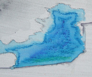
 John Constable (RA), 'Study of Clouds', 1822. Museum no. 590-1888, V&A Museum, London
I'm currently in London and have a couple of hours free this afternoon. In the West End, I'm planning on going to the Victoria & Albert Museum to have a closer look at some of the English Romantic landscape painters - notably Constable and Turner and their ways of representing skies and clouds.
I've come across them for my cloud studies, but also in Christopher Bellinger's new blog where he has been writing about Constable himself called 'skying' - the study of skies and clouds. I do like the term a lot - so much in fact that I will need to have a closer look at his studies myself. I've come across some of the online resources and images by him - notably one painting available at the V&A. It is this one at the start of the post.
Monday, 27 August 2007
Working with progress
The landscapes from earlier this summer have been sitting in my living room and I've been going back to them frequently to work them up initially as oils and pastels. The plan is that once I've done a few more realist, scenic compositions I can then go and abstract from various parts of the actual paintings, rather than using the initial sketches and photo references.
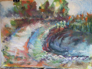
The progress on getting to those abstractions, however, has been a bit slow. Nonetheless, one of the larger pastels is getting to the point that it is almost finished. I've been reworking it a quite a few times and now feel that it's almost done. Funnily, the very reason for starting this scene - a series of strong, almost unreal, shorelines along this loch shore - has been what's been problematic.
Just for fun, I thought I'd post a before and after picture to offer as sense of working through a painting and exploring the success of a particular composition.
Shoreline repetitions, Pastel on board, 70x50cm
BEFORE:
 AFTER:
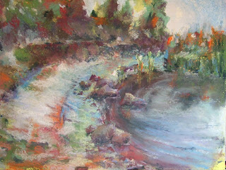 Now, dear reader, can you spot the 10 changes between the two paintings? Happy searching!
Saturday, 25 August 2007
I've been setting up shop
... at Etsy.com - an exciting 'sell your own' website for everything handmade.
I've come across the site a short while ago - mainly because I was getting bored with the endless posters that were sold as artwork on ebay. So, I spent the past few hours cutting a few more mountboards, finalising the Window to the Sky studies, photographing and uploading them to my new Etsy shop.
Come and have a look around at Paint & Pastel at Etsy (http://gesah.etsy.com) or have a look at the new item on the sidebar.
The shop is still pretty much work in progress, so, again, any feedback or thoughts are very welcome. But also take your time to browse Etsy - with all its colourful pictures of other people's creation it's a beautiful site to pass one's time.
... now on to some more painting :)
Thursday, 23 August 2007
In the zone...
 Garden door, Crail, Mixed media in Sketchbook, 14x21 cm
Earlier today, a colleague mentioned how he'd been sketching while on holidays and how relaxing he found it just to focus on one thing at a time.
This feeling of 'being single-minded' resonates with my own thoughts on sketching. In fact, it was the recent class on reflective surfaces that reminded me of it: loosing myself in the observation of one object, its details, and how in turn these details make up the object and the scene.
There are many blogs and sites on the web that discuss sketching, keeping sketching journals and many of them discuss this simple beauty of making 'Travels with a sketchbook' (as Katherine Tyrrell's blog is called).
'Travelling' both literally and metaphorically is a good point here: while sitting still or standing to take in the scene and to get down a sketch, our eyes are all the same busy with watching, looking and our mind is busy making sense(s) - and so are our hands with pencils, graphite or other tools.
Here are a few recent discoveries of sketching/drawing blogs:
'Flow' is the term used in psychology on this sense of absorption and interest created by a challenging and interesting task. See here for some elaboration in a Wikipedia entry. And below are some examples of my own flow when sketching (all mixed media in sketchbook, 14x21 cm) in Crail - a very cutesy fishing village in Eastneuk:


Wednesday, 22 August 2007
Reflective surfaces
 Green in the bottle, Pastel on Colorfix, 23x30 cm
I went to a day course yesterday on painting reflective surfaces, and we were asked to bring along whatever medium we'd like. I took the pastels - they seem to be my firm favourite now and with some rearranged storage solutions (more on that later), they are so easy to pack up and take with me.
The course covered the two different types of reflection: (a) reflections within an object - such as stainless steel flask in first image, and (b) reflections of objects within something else. The second one is the more common one, and in particular deals with water surfaces.
A couple of useful tips included
- that colour doesn't reflect as intensely, in particular the further it is away from the breaking point
- that the size of reflection depends on position of observer, i.e. in case of water surface, the lower down the view point, the more elongated does the form appear in its reflections (which has to do with different angles of inflection and reflection.
In the morning, I did quite a few sketches of a facetted whisky flask which reflected beautifully a rather garish green striped table cloth. Finally, I did the pastel sketch above.
 Rocky shoreline, Pastel on Colorfix, 23x30 cm
The afternoon focussed on the second type of reflection - water surfaces reflecting landscapes, boats and other objects. I had enjoyed doing the whisky flask from life, but with the water reflections this was going to be more difficult. Hence, the afternoon sketches were done from photo references. I had picked one which I liked for the colours and also for it being similar to many of the other photos and sketches I’ve done in Ardnamurchan and Perthshire earlier on in the summer.
Monday, 20 August 2007
Summer fruits
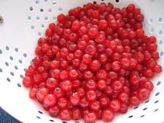
...continuing my mostly virtual celebration of summer (but: as we speak the sun is actually shining into my living room!!!), I found some more soft fruit in the shops... this time redcurrants, and made yet another batch of jam, this time with half redcurrants, half strawberries (for a fuller recipe, see this post here). I must admit that I always get excited at the sight of summer fruit and vegetable - something about its freshness and beauty. This was on my kitchen counter last night:
While I've been sketching skies, clouds, rocks and trees this summer, I should take note and plan something on vegetable and fruit for the next summer... so, note taken.
I had started a few fruit sketches at my parents, and here's one with some plums on a branch.
 Plums, Mixed media, sketchbook, 14x21 cm
Saturday, 18 August 2007
Making mountboards
The mountboard cutter I had ordered a short while ago has finally arrived. So I spent the afternoon experimenting with it. Surprisingly, it was a lot easier than I thought it would.
Basically, in order to cut bevelled edges at a 45 degree angle, one needs to cut along lines marked out on the back of the mat. The trick is not to overcut (i.e. cut too far along the line) nor undercut (cut too short) so that once each of the four sides is cut, the middle falls out neatly.
The cutter I bought, after reading some reviews on different systems, is a MatMaster by Frame Co. The company's website here has very accessible instructions on cutting not only single mounts but a whole range of complex mountboards. I just bought a basic set with a short (66cm) ruler - I really wanted it to custom frame my studies and sketches that are odd sized - such as the sky and clouds studies.
 WTTS # 3, mixed media on board, 11x11 cm
I have now cut the first lot, together with a base mat. All the studies are relatively small (such as 9x9 cm) and I mounted them so that they will fit a standard 24x30 cm frame. This means, the little abstract studies are centre stage within a rather large mount and frame - this way the framing adds some impact to the small pictures.
Thursday, 16 August 2007
Jam making and creativity
 ... yesterday's post on how to find subjects to write about is still rippling through my mind. At lunchtime yesterday I had bought a pound of raspberries and greengages. Raspberries in particular have become the fruit of summer for me since I moved to Scotland: so many of them are around and for such a long time that I do on occasions stop minding too much rain.
A fews years ago, when I was finishing my PhD in geography and got exhausted from the sheer endless writing up of all those pages and the constant skintness, I started making jam. My grandparents had an allotment and there would be so much jam made and fruits bottled, similarly, many of my friends would try out new recipes for all the strawberries, currants, plums and so on in Germany. Making jam - if not having a garden - was a way of being closer to them, but also something practical that I really longed for. Subsequently, my shelves - and those of my friends here - got filled with all sorts of jam creations (mind you, that grape and red wine jelly was rather disappointing).
I haven't made much jam in the past few years - I actually rarely eat jam in the morning and there's only that much you can give away. But the practicality of something other than thinking/writing academically was absolute joy - in the process I tried a variety of other things, such as knitting and crochet. While they open up a number of possibilities, their creative potential seemed however rather limited - in the end, the jams I kept liking most and making again were redcurrant, plum and raspberries - so, nothing fancy at all.
Do you see where this is going? When I started drawing, the technicality of the tutor's instructions was easy enough to follow but it took a good few more rounds of being lost and starting to do things differently and 'just try this and see what happens when I do this' for me to get a sense of the endless possibilities and openings of painting and art in general.
This looks like a post that I will be coming back to. But in the meantime, here is a link to a blog which has a whole series of interesting thoughts and commentaries on creativity Libzoid is by Libby Mills, an American artist who works with polymer clay. I enjoy visiting her blog to get pointers on work process, inspiration alongside a commentary on a medium I know very little about.
In the meantime: This is what I had for breakfast
 Greengage (Mirabellen) and raspberry jam
500 g raspberries
500 g greengages, finely chopped
500 g 2:1 jam sugar
Mix all in a large pot, mash the fruit up thoroughly and let sit for a couple of hours
Bring slowly to the boil while stirring
Let cook for at least 3 minutes
Fill in sterilised jars immediately and seal.
Tuesday, 14 August 2007
Keeping writing... keeping painting

WTTS #13, mixed media on WC paper, 5x8cm
Since I started writing here, I've come across an increasing range of other blogs - many of them are fascinating and the ability to go back frequently to see new posts and comments has been a true insight for a new use of the internet that I did not appreciate beforehand.
One post I came across today and which perfectly brought up a number of issues relating to writing entries on the blog is on Katherine Tyrrell's Making a Mark blog.
In Making a Mark: How do I find things to blog about? Katherine offers a detailed list of how to find topics to write about, how to organise ideas and entries. I had to smile particularly at her suggestions that, when one starts one wants to present all knowledge in one go - rather than breaking it up and organising it more sequentially, narratively - I perfectly remember the desire to have everything on the page at once without much patience of letting things build up. Partly, that probably came from a bit of anxiety and apprehension that I would run out of things to say.
Reading Katherine's post however, made me understand more clearly, that, of course, as well as with most other things, curiosity is created in the process of exploring something - which throws up more questions, and more openings.
In this, blogging is very similar to actual painting/sketching. When I started drawing, I could not for the life of me find things to draw - as if the translation between what I would see everywhere around me to something I would try and put down on paper just didn't exist. With time, it was fascinating to see how suddenly everything around could turn into something to draw/paint - suddenly the overripe pear in the fruit bowl transformed itself into a fascinating still life and the grey low clouds starting showing off their yellow, blues and purples.
Sunday, 12 August 2007
Website blurb... help needed
... not often that I post twice a day, but tonight I finally made myself write through the two missing pages for the website: the intro page and the about me - can't imagine why I was procrastinating over these two ;).
In any case... I thought I may get some comments from you if I post them here. Please have a read and I'd gladly receive any comments... in particular if it sound too weird and laboured!
These will be really the only two pages with much text on them, the rest will be rather plain pages with picture with a bit of info each.
Many thanks!
Homepage
About me blurb - this is anything like a resume/cv/artist statement, but I felt I need to have something to put in there first :)
Thanks again!
In any case... I thought I may get some comments from you if I post them here. Please have a read and I'd gladly receive any comments... in particular if it sound too weird and laboured!
These will be really the only two pages with much text on them, the rest will be rather plain pages with picture with a bit of info each.
Many thanks!

Homepage

About me blurb - this is anything like a resume/cv/artist statement, but I felt I need to have something to put in there first :)
Thanks again!
Painting from photos
The online artforum WetCanvas frequently holds various type of projects. I've come across the Landscape forum's August project. Containing a series of photo references, various people submit and discuss their interpretations of these. Since it's not limited to one medium (such as oil, pencil or similar) and usually gets quite a few people involved, it's an interesting opportunity to see other people's interpreations and techniques for painting similar references.
The project photos contain various rock formations - and so I quickly jumped at it. I've been doing more sketches from my own photos and references to practice rocks, their internal structures and overall form - trying to keep the balance between generic (this is an angular rock) and more specific characteristics.
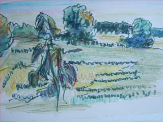
These are the two sketches I did for one of the reference images:
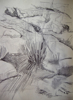
Pencil in sketchbook (14x21 cm)
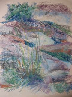
Pastel on paper (30x40 cm)
The reference photos are all very interesting and fascinating, still, there is something strange about drawing from photos, in particular if it's other people's photos... all that goes along with the impression of the actual scene is gone or not there in the first place. It reminds me of the painting week in Perthshire - and the difference between the impressions on site and the actual photos.
The problems associated with painting from photos are well-known, and most people who paint from photos are aware of them and acknowledge them. Yet, reference photos remain an important tool to help painting indoors. Charles Sovek has a couple of good pointers in his Lessons from the Easel on how to improve the reference photos to reintroduce the vibrancy of actual scenes back into paintings.
The project photos contain various rock formations - and so I quickly jumped at it. I've been doing more sketches from my own photos and references to practice rocks, their internal structures and overall form - trying to keep the balance between generic (this is an angular rock) and more specific characteristics.
These are the two sketches I did for one of the reference images:

Pencil in sketchbook (14x21 cm)

Pastel on paper (30x40 cm)
The reference photos are all very interesting and fascinating, still, there is something strange about drawing from photos, in particular if it's other people's photos... all that goes along with the impression of the actual scene is gone or not there in the first place. It reminds me of the painting week in Perthshire - and the difference between the impressions on site and the actual photos.
The problems associated with painting from photos are well-known, and most people who paint from photos are aware of them and acknowledge them. Yet, reference photos remain an important tool to help painting indoors. Charles Sovek has a couple of good pointers in his Lessons from the Easel on how to improve the reference photos to reintroduce the vibrancy of actual scenes back into paintings.
Thursday, 9 August 2007
Sky and cloud studies
After having drawn, sketched and painted a few of the mixed media sky studies in pastel, pencil, pen, watersoluble graphite and neopastels, I assembled them in a collage. I've been making these small studies of skies and clouds for the past couple of weeks (see my first post on this here). Most of them were done in the morning from my living room window. But I continued with them when I was in Germany.
Most of them are on gessoed bristol board which I had prepared for pastel paintings - the vast majority of them are small, ranging from 6x8cm to 15x15cm, with only a couple the size of my sketchbook or A4.
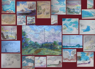
Collage of Window to the Sky studies #1-24
This has been a curious experience, in terms of subject matter, medium and scale. As clouds on the Scottish West Coast move pretty fast, it made me look for generic pattern, shape and light quickly and then decide on a couple of formations to get down on paper - I often did one, two or three studies in one go (which helped when the first ones didn't end up the way I'd wanted them). The watersoluble neopastels and graphite pencil have become a firm favourite for sketching - in particular on the prepared board their pigments grip nicely onto the tooth of the paper and produce interesting effects when brushed over with a waterpen:
WTTS #4, mixed media on board, 15x15cm, detail
I did a few evening skies when in Germany, most notably, the pastel sketch Am Abend. After observing and trying to get the skies down on paper, I surprised myself at how easy I found to see colour variation, the subtleties that make clouds appear three dimensional and the various shades of blue, purple and grey that denote good weather clouds or rain.
Most of them are on gessoed bristol board which I had prepared for pastel paintings - the vast majority of them are small, ranging from 6x8cm to 15x15cm, with only a couple the size of my sketchbook or A4.

Collage of Window to the Sky studies #1-24
This has been a curious experience, in terms of subject matter, medium and scale. As clouds on the Scottish West Coast move pretty fast, it made me look for generic pattern, shape and light quickly and then decide on a couple of formations to get down on paper - I often did one, two or three studies in one go (which helped when the first ones didn't end up the way I'd wanted them). The watersoluble neopastels and graphite pencil have become a firm favourite for sketching - in particular on the prepared board their pigments grip nicely onto the tooth of the paper and produce interesting effects when brushed over with a waterpen:

WTTS #4, mixed media on board, 15x15cm, detail
I did a few evening skies when in Germany, most notably, the pastel sketch Am Abend. After observing and trying to get the skies down on paper, I surprised myself at how easy I found to see colour variation, the subtleties that make clouds appear three dimensional and the various shades of blue, purple and grey that denote good weather clouds or rain.
Tuesday, 7 August 2007
Favourite buildings
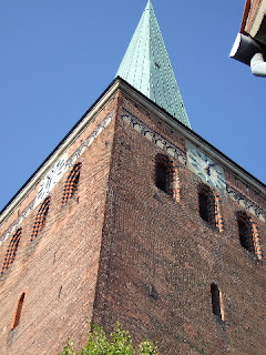
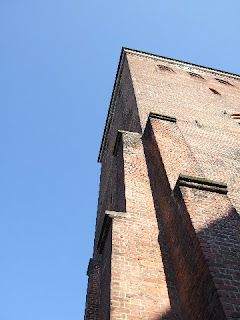
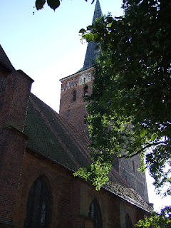
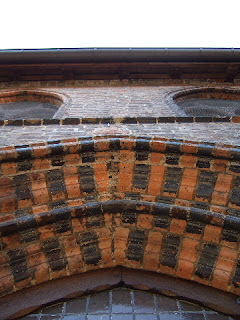
It's photographs not pastel sketches today. Back since yesterday, I've just downloaded my photos onto the computer. Besides the sketches and relevant reference photos, there are a many of one of my favorite buildings. It's the St Marien Kirche, a church right in the centre of the small town of Uelzen. Built in the c13th in a style known as northern German brickstone gothic (beware of literal translations again!), it's proportions - plump and wide with a tall solid bell tower - always made me stop, wander around, look up and all around, just to start all over again.
There is something with its proportions that give it solidity and elegance at the same time. I was looking for some good websites, but all I could find were about church services and Christmas carols... which I will just give a miss I think.
With plenty of visits to the town, I took my camera with me on the last day - but really, a sketchbook would have been much better, and I need to remember that for the next time I'll be going. Have a look for yourself:


Sunday, 5 August 2007
'All good things...
... come in threes' sounds a bit too much like a literal translation from German into English. But never mind that, here's the third post while in Germany.
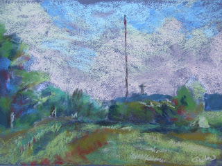
Am Abend (Windows to the Sky #22)
Pastel on Colorfix board, 35x25 cm
This is the view from my parents' backyard. And it is also the reason why we ended up in this remote village at all. My dad was based at this telecommunication transmitter from the early 1980s onwards and would drive past the derelict farmhouse to and from work everyday. During those years, my brother and I would listen to a lot of stories on how great life on a farm with a large garden, animals etc would be like.
A few years later, the move was announced, and without knowing where we'd go, I exclaimed: 'Moving's fine with me as long as it's anywhere but Bokel' - the remote village, surrounded by heathland, dark pinewoods and the subject of a couple of scary stories was a place that I didn't fancy at all.
It didn't help: our house in the outskirts of a small town was sold and the farmhouse bought, my brother and I changed schools and left friends, and it took a good wee while to settle. Eventually, imaginary scary stories were replaced with the day-to-day scarieness that is rural teenage life.
Here are a few prep sketches:
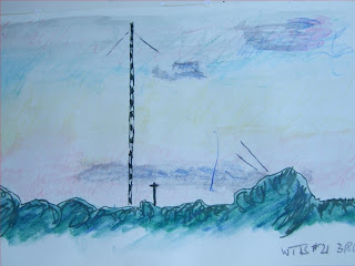
Neopastel II, marker pen on paper, 21x14cm
Neopastel II, marker pen on paper, 21x14cm

Am Abend (Windows to the Sky #22)
Pastel on Colorfix board, 35x25 cm
This is the view from my parents' backyard. And it is also the reason why we ended up in this remote village at all. My dad was based at this telecommunication transmitter from the early 1980s onwards and would drive past the derelict farmhouse to and from work everyday. During those years, my brother and I would listen to a lot of stories on how great life on a farm with a large garden, animals etc would be like.
A few years later, the move was announced, and without knowing where we'd go, I exclaimed: 'Moving's fine with me as long as it's anywhere but Bokel' - the remote village, surrounded by heathland, dark pinewoods and the subject of a couple of scary stories was a place that I didn't fancy at all.
It didn't help: our house in the outskirts of a small town was sold and the farmhouse bought, my brother and I changed schools and left friends, and it took a good wee while to settle. Eventually, imaginary scary stories were replaced with the day-to-day scarieness that is rural teenage life.
Here are a few prep sketches:

Neopastel II, marker pen on paper, 21x14cm

Neopastel II, marker pen on paper, 21x14cm
Thursday, 2 August 2007
More memories
My parents had bought a derelict farmhouse when I was 13 and we moved to this village where over the next years my dad with various help from all sides would rebuild the house and various outbuildings. Soon after we finally moved into the renovated building in 1989, my parents were set on taking down the glorious chestnut tree that has been there for ages and in (sad) anticipation I painted this one:
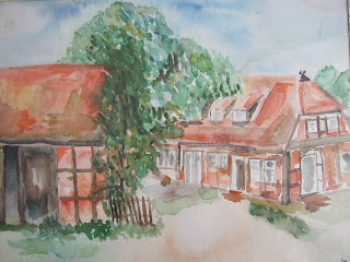
Watercolour on paper, 40x30cm
What happened next wasn't that the tree disappeared completely but instead was rather harshly cut back. However, 17 years on, it's grown back happily - and as you can see, too, the barn had received a facelift in the meantime too. In fact, my dad is now on the final building - a washhouse and storage building that is struggling to keep its roof.
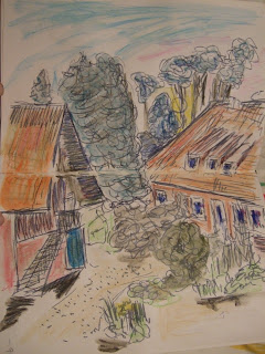
Pen, Neopastel II in sketchbook, 21x28cm
Wednesday, 1 August 2007
School days
I'm at my parents for my Mum's birthday. My Mum was telling stories of how apparently I've always enjoyed painting... according to her (and of course completely different to my memories) in kindergarten papers and pens were rationed when I was around as I would go through three paintings where others did one - 'easily bored' I think is what my Mum would call it.
Anyways, my memories of painting in school were rather uneventful... don't think that much of it seemed important and I was indeed easily bored. I discovered the folder of some of that school art, and with it probably one of the reasons for that lack of inspiration:
Sheet upon sheet filled with perspective drawings; two vanishing points, one vanishing point, interiors, exteriors, houses in suburban settings, in woodlands etc... all seemingly preparing one for a career in technical drawing.
Have a look for yourself:
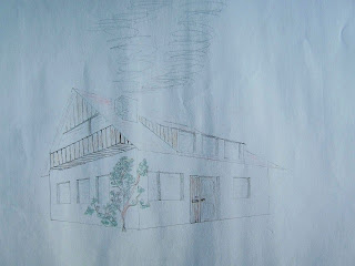
Pencil on paper, 40x30 cm
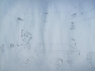
More pencil on paper, 40x30cm
And hey ho, here's some cubist colour theory:
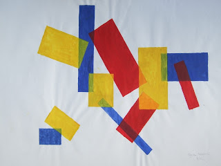
Poster paint on paper, 40x30cm
Subscribe to:
Posts (Atom)