Monday, 28 April 2008

Retrofitting

... my sparse graphite in Moleskine sketches (and assorted others) to a new life as Flickr set and group identity.

Lessenings7_5

Somewhere near Stranraer, Lessenings 7_5,
Graphite in Moleskine, 21x14cm


It was yellow Steph whose comment on one of my graphite redux got me thinking. So, I hunted in my various (not very well organised) online folders for various sketches - mostly landscapes, virtually all graphite or pencil, though I included a few watercolours, ink and neopastels. I called them lessenings - as lesser and lessons.... very clever, huh?! And here's a wee taster.

In fact, yesterday was warm and sunny and I went to the park with my sketchbook. I kind of figured it would be one of the last opportunities to sketch some bare trees before the leaves get going properly. So, while I did the below (amongst worse others), I realised that my summer park sketching would be: PEOPLE. They were everywhere, doing all sorts of things - and, better than at airports, they were chilled, relaxed and happy - makes an easier subject; which is all the better seeing that I'm not good at this. But I do have a while to work myself up for that task - and keep looking at other people's people sketches - such as Lindsay's or Mithi's. Or maybe that will just keep me from doing some of my own??

Victoria Park, Just - aka Lessenings 9_1
Graphite in Moleskine, 21x14cm

Friday, 25 April 2008

Which one for a postcard?

I thought I'd ask you for your thoughts on this one:

With the exhibition coming closer, I'm trying to decide which scene to take for a promo postcard.

I've had a couple of cards made a while back, but I want to have one of the pieces in the exhibition to feature on the postcard and none of the previous motifs will go to the exhibition. I also want something that gives a sense of the work I've been doing recently (and that I want to do).

Here are a few examples - and I'd appreciate your thoughts and preferences on these.


A detail of one of the mixed media collages such as this one:


Sunny, cheery gouache and pastels on paper - and a definite landscape:

Another definite landscape - less cheery, a bit more recent:


Or a bit less recent again, less landscape, still mixed media, no glue and limited palette?


Well... I think I've got my favourite - which is yours?

Wednesday, 23 April 2008

Paintings I like #2: Bird Cloud, Lyonel Feininger

Lyonel Feininger, Vogelwolke (Wolke nach dem Sturm),1926
Oil on canvas, 44x72cm
Busch-Reisinger Museum, Cambridge, MA

Vogelwolke - Wolkenvogel; Bird Cloud - Cloud Bird.

It was the onomatopoeic [that sounds rather posh for the German lautmalerisch that I had in mind] qualities of the German title of Feininger's painting that kept me occupied when I first saw it: The sounds the words make.
Or was it the vast expanse of the cloud over a low horizon seascape...
Or was it the beauty of the concept: an airy cloud in the shape of a huge bird.
Or was it the yellow of the beach and the lonely figure on the left.

In any case: it's been a firm favourite of mine since I first came across it in print. The format and the rather restrained composition: strong horizontal lines, a single figure to the front left and above it all the majestic cloud, its wings, its beak.

After my sketching of lonely women in the Fogg Museum I ventured around the corner and stumbled right across it. Didn't know it was there, so it was an absolute surprise, gave me goosebumps, made me circle around the painting for ages, up close, far away, almost poking my nose at it, trying to figure out how Feininger made all those lines, variations of colour - restraint and yet so varied. Walk away, went back - in the process almost ignored the excellent German expressionists that hang close by: E-L Kirchner, Otto Mueller, Max Beckmann. Sorry, guys - you'll have to wait until the next time.

It's all about the Vogelwolke/Wolkenvogel today.

Two sketches of the Bird cloud, 1924
(top one in pencil, bottom one in ink and wash)
Also at the Busch-Reisinger Museum, Cambridge, MA

And these I found in my Feininger book: sketches after he saw the Bird after a storm, note how he changed the composition to a horizontal one in the oil painting, done a couple of years after the sketches.

Tuesday, 22 April 2008

Feeling a bit...


Pencil sketch in Moleskine, 9x14cm of
Pablo Picasso, Woman with a Chignon, 1901
Fogg Art Museum Harvard, Cambridge, MA

... like her here - parts of me got stuck across the Atlantic it feels and I need a wee while to arrive properly again. Just before leaving Boston on Sunday, I had stumbled across a couple of good paintings in the Fogg Art Museum at Harvard. Amongst them this one by Picasso and another one by Toulouse-Lautrec: the Hangover.

Henri Toulouse-Lautrec, The Hangover (Suzanne Valadon), 1887-1889
Oil on Canvas, Fogg Art Museum Harvard, Cambridge, MA

While the latter one is an intriguing sketch in oil - lots of squiggly, dynamic lines to make up the scene of a woman sitting alone at a table with a bottle of wine. Picasso's painting is one of those intriguing figures/portraits of his where the figure is flattened. Picasso's abstraction in fact made it fairly easy to sketch from. Redrawing, paying attention to proportions, gestural marks and so on. A good thing to remember!

Tuesday, 15 April 2008

Locational confusions

... mean that I am away again. Five hours earlier than usual, it's been an early morning session in a hotel lobby in Boston.

Until there's more sketches and photos, this one will have to do.

Windswept Scottish hilltops with just the barest bit of tree line, done a few weeks ago along the Ayrshire coast.

Hilltop. Graphite and rain in Moleskine, 21x12cm

Friday, 11 April 2008

"Favourite artists"

is supposed to be the name of a new sidebar addition.

Sicile, Nicholas de Stael, 1954
Oil on canvas, 114x145 cm, Musee de Grenoble

But this is proving more difficult than I thought. I've been trying to locate museums, official websites or similar, and am already faltering. Wiki is proving fairly reliable, if less so on some of the lesser known ones. Or, I could pick museums with some of my favourite artworks as links; Or I could????

Do you link to artists' (dead rather than living) websites? What do you link to?

I think my current preference is actually to link to a google image search on the respective artist. I've tried a few ones, and it seems to work ok. In some sense it could well be appropriate - most of the reasons for me being intrigued by artists at the moment are intensely visual: it is their art, painting, and increasingly also their drawing, studies, work process. And then there's the element of luck, change and dynamism in a search phrase as link.

Here's the short list to start with


I'll give it a try. But am also keen to hear other people's thoughts and suggestions...
In particular with some lesser known artists, the image search gets a bit messy - see, e.g., Anna Ticho, but then again, there isn't much in way of her images, e.g. at the site of the Ticho House in Jerusalem.

Tuesday, 8 April 2008

For those precious found papers

... there are image transfers.


In one of my recent envelopes I received something too precious to cut up, glue on and paint over. It's a handwritten letter from my friend's gran. I think I'm getting very sentimental about things like that, in particular since I have only one grandparent left (who incidentally doesn't write letters but talks on the phone once in a while).

I did a big of digging around - remembering that much of mixed media and altered media works with transfers - image transfers with gel medium, alcohol or various other ways - not dissimilar to monotypes in printmaking.

So, I scanned in the letter, printed it on ordinary paper, treated the surface of the receiving paper with some acrylic gloss medium, positioned the print out onto it, used the back of a spoon to burnish the paper thoroughly before starting to peel off the print slowly.

There are various posts - some tell you to remove the print before it's totally dry, others want you to wait til it's dry - the paper separated quite neatly to leave the ink printing on the receiving paper. Some of the stuck on paper can be peeled off carefully once the medium has dried. But it requires some experimenting with best times, best effect etc. And once finished and dried should be sealed with some acrylic medium before proceeding further.

Transferred onto the prepared collage background.
Left the original plain paper, right the collage piece with
two layers, one in black and one in blue -
I'm pleased that the blue transferred quite strongly too,

I actually liked the effect of some transfer paper remaining stuck.

This plain paper transfer is a really simple technique - it produces a soft type of transfer but even for writing it seems to work to the extent that I was looking for.

Here are some useful posts and sites I've come across in the process,
  • starting with the WetCanvas post on image transfers here
  • the plain paper transfer is taken from this site here
  • and Toni's A Spattering blog has a couple of further useful posts on transfer techniques here
Using the project for this kind of technique explorations is really good fun: it's plenty of reason enough to try out some of the more involved collage techniques as well as to push what particular media can or cannot do. - Otherwise it would be too much of an assembly line of artist books, anyway, wouldn't it.

Maybe you want to know, but I've now received twelve envelopes with various bits and pieces of recycling from Chicago, Ayrshire, Belfast, Edinburgh, Glasgow, Glasgow, Newcastle (Australia), Jerusalem, ... and I've been told there are more in the post from Jerusalem (again), Birmingham and Sunderland... very good. I probably need a bigger box for the envelopes soon.

Saturday, 5 April 2008

A flat black sky

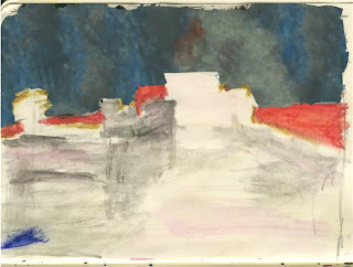
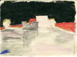
... occupies the top third of Nicholas de Stael's Agrigente from a couple of posts ago.

A few weeks ago I took a couple of de Stael's paintings and copied their composition. It's something I hardly ever do, taking someone's else' art to work from directly. But trying to unpack composition and markmaking for some of Joan Eardley's landscapes back in autumn has proven extremely helpful in understanding the strength of those paintings and compositions - and in learning a little bit about Eardley's work process.

I had started to use both oils and acrylics a bit more in the sketchbook, - not getting too worried about oil on paper was actually quite helpful for that.

I begun with my usual water-soluble neopastels, took what I thought to be two of the simpler de Stael's - the already posted Agrigente was the first one. And ended up with this sketch:

Sketch in Moleskine, approx 18x12cm
Based on de Stael, Agrigente 1953
Graphite, Neopastel 2
[well: a photoshop mock-up of it]

Ok... but not really there, is it? And that is nonewithstanding the skewed proportions.

Attempt no 2: Take some acrylics - don't mix black but take black out of the tube.

Sketch in Moleskine, approx 18x12cm
Based on de Stael, Agrigente 1953
Graphite, Neopastel 2, Acrilics


Just as much as I shied away from using white (until the Winter Field paintings) so I did with black - I would go as far as Payne's Grey and then leave it, try to mix darks otherwise or so.

Although the first sketch is a photoshopped approximation of the colour I had initially used, the flatness of black - coupled with the quality of acrilycs - flat and plasticky - made this work much better and took it closer to de Stael's original. It's a good example, I think, of how a simple composition relies on effects of medium, support and application to work; and that other media don't get you there.

Wednesday, 2 April 2008

Unpacking the Found Papers Book

... presented as post-hoc rationalisations, these thoughts here in fact came well before yesterday's post. Well - thoughts? Hm, not quite - some hand, brain, eye coordinations which led to some sustained exercises in general craftiness...

[some spillover from the day seems to be going on: writing conference papers is what I've been doing over the past few days, and it looks as if academic practice translates into blog posts, my apologies: this is distinctly wafty... as in fact the paper still is... but bear with me]

A book format such as the loosely, with a string, strung together palm leaf booklet [talked about here] seemed much better than merely a two-dimensional canvas for the found papers.

The string acquired some beads - paper beads, made out of some of the found papers too.
I came across paper beads first on etsy. They are so simple to make and can be customised into different shapes, but more importantly colour-coordinated sooo easily: just use the same found papers, coloured papers, and hey presto: there's your perfect accompaniment.

Paperbeads

An instruction for the beads is here. They are cut strips of paper, rolled tiedly together on a skewer or similar, then fixed with glue/ gloss medium to acquire some strength. And that's it.

The cover is some left over postcards, covered in more found papers - some of the yellow envelopes I got from Australia are perfect - there's some stamping, some addressing and general texture. Again, glued on with decoupage medium, covered with decoupage medium and thoroughly dried it's pretty sturdy and looks generally undestructable (though that's deceptive I suppose).

Inside cover with title

Title and signature go inside the cover. It's rather conventional, as far as collage titles go, but good nonetheless: This one is called Moin Olle: Sondervig. Slupsk - Taken from some text on the collage, and the two most outlying place names from the map on the back.

Half the postcard format is perfect for a good cover of the booklet.

This observation leads to the final, most important (?), point on the format... but that'll take a bit longer, so it'll have to wait til tomorrow...

Tuesday, 1 April 2008

Found papers update: Prototype

The actual book with cover


I've got a prototype for my found papers project. It took me a while and several iterations to come up with a format that I felt would work and would reflect the idea of found papers from different place and people - if you want to check back to the start of the project, read this first post, and check out the tag Found Paper project.


The whole collage: Top row is the back, bottom is the front,
each side measuring 39x9cm
[Click on the photo to see more detail...
Blogger wasn't playing ball with this one]

So, after roadtesting a variety of glues, sealings and varnishes, here is Found Papers Book #1.
I will say a bit more about format, cover and general craftiness involved in one of the next posts, but it's too late for that tonight.

Found Papers Project Book #1, Card 1
6.5x9cm

Thus, only briefly: a couple of snapshots, and a lazy link to some more in this Flickr set.

And inside: the palm leaf book form - though not terribly neatly laid out